

Why would an SEO limit themselves to some keywords, when all keywords are available?
Historically, it’s been a matter of resources and capacity. The more data points you introduce, multiplied by the number of keywords you’re tracking, the faster it becomes unmanageable. When using a typical SEO platform to track keyword data, it requires prioritization and selection of a more limited keyword list that leaves off low-traffic queries and details about things like rich results.
That’s where big data, in the raw output form that can be parsed by BI tools, comes in to expand a keyword universe.
We’ll walk through the process of what raw, big keyword data looks like, how it’s given the structure that allows it to be manipulated, and the qualities your business should look for when choosing a BI tool that will allow you to turn data into insights.
Why use Big Data for SEO
SEOs or digital marketers have a finite amount of keywords for their brand that they have the capacity to track. Typically, this is determined by the keywords that are known to drive traffic to a site, with the threshold being a significant number of clicks.
What happens when you have a very niche longtail keyword that only generates a nominal amount of clicks? It’s probably not going to move the needle on your bottom line, so it gets left off the list of priority keywords to track. Then you have a few more very niche keywords that generate just another handful of clicks.
For many businesses, this list of “insignificant” keywords can grow into the thousands, where the aggregate of all those nominal clicks suddenly has a lot more power over your business than you originally expected. For example, listen to Wil Reynolds of Seer Interactive recount his experience with discovering that 300,000 previously ignored keywords with ~1 click each accounted for 92% of his client’s traffic.
The problem then becomes the ability to scale the keyword research process to track exponentially more keywords, as well as more SERP data points, like various rich results.
When the capacity of an SEO tool is limited, it makes sense to prioritize and limit keyword lists or the search features you track. However, moving to big data where the data is in its rawest form—and able to be pumped into any analytic environment—allows businesses to expand their keyword universe to all keywords, not just a “representative” sample size.
To start, you will have to decide what this analytic environment will be, and how you will process and manipulate it without a typical SEO platform. Traject Data can be directly connected to the BI tool that your company likely already uses to make other data-driven decisions. Next we’ll dig into the process the data undergoes so it can be parsed into useful data sets and made ready for that BI tool.
How Traject Data can be used
With more SERP data points now available for tracking, use cases for leveraging the data have increased as well. Here are a few things your business can do with Traject Data:
- Inform organic SEO and content creation strategy.
- Track keyword rankings across millions of keywords.
- Identify industry trends and evolving SERPs.
- Blend with other data sources to identify revenue-generating keywords.
- Optimize advertising campaigns based on evolving search engine algorithms and search intent.
- Monitor local performance across geo-location specifications.
- Track Google eCommerce performance.
- Develop a YouTube content strategy.
What does “raw SEO data” look like?
Raw data from the Traject Data SERP API comes in the form of JSON files that describe any given SERP, including the search features, ranked websites, and anything else that appears for that particular query. Imagine you query “teriyaki and wok” and you’re shown this SERP. You’ll notice that result #1 is a standard blue link, not a local pack, a video, or any other type of search feature.

The output from the Traject Data SERP API for this query would look like this:

Underneath “SERP” in the JSON file, each ranking position will be labeled by number and list out the attributes of that ranking position. In the “teriyaki and wok” case, you can see the data for the link, the description, and which types of search features do and do not take up position #1 for that query.
If you were to keep scrolling, the same data would be listed for position #2, #3, and so on for that query’s SERP.
This more comprehensive set of SERP data points allows SEOs to increase their control over all the possible rich results at their disposal. Tracking this data will show rich results they’ve won and lost to competitors, search features that are new to a keyword after Google makes an algorithm update, and other data points that will help them home in on all of their high-return traffic opportunities.
These are some of the most common rich results that we provide data on. You can click through on each to learn more about how you can leverage them.
| Organic Results | Paid Results | Local Pack |
| Knowledge Panel | Image Pack | Video Pack |
| Answer Box | Mini Sitelinks | Events Pack |
| Shopping Box | News Pack | Job Pack |
| People Also Ask | Related Searches | More… |
Ready to See What Traject Data Can Help You Do?
We’re your premier partner in web scraping for SERP data. Get started with one of our APIs for free and see the data possibilities that you can start to collect.
How is this data converted into something I can manipulate and draw insights from?
The information in the JSON files is pretty extensive to look through for just one SERP. This raw output would be almost impossible to manipulate without building logic, or using a tool that can sort through it to access what you need and create more relevant datasets.
The Traject Data SERP API JSON files are stored in Amazon S3 or similar. There, the data points from the JSON files are structured and tagged into individual fields so that they are able to be queried, sorted, and more easily analyzed. After the JSON files have been given this structure, using a product like Amazon Athena gives you the ability to query the database and pull the selection that’s interesting to you.

This staging ground and additional ability to organize the data creates a way for previously unmanageable amounts of data to be pulled into subsets that are relevant for a certain report or analysis.
Leveraging a BI tool
The dataset is now ready to be connected to your BI tool which will allow you to visualize it for easy understanding. From there, you can build reports and combine it with your business’s other data, like sales and marketing data.
BI tools are an important cornerstone to this process because the visualizations allow users to discover new insights with the time and expertise (or bias) that would typically go into creating pivot tables to investigate a hypothesis.
With the various tools that are compatible with Traject Data, users can toggle between different types of visualizations much more deftly than building out a new analysis manually each time. Expert level BI users can manipulate the data into more complex visualizations, but beginner level users can still glean a multitude of insights from the visualizations the tool suggests, once the data finishes populating.
Traject Data keyword data is able to connect to all of the most common BI tools on the market. To make a decision on which BI tool to use, consider the required skill level, pricing, and capabilities below.
Compare and contrast BI tools
Tableau
What it is
Tableau’s innovation was completely centered around enabling visual analysis.
Tableau connects and extracts the data stored in various places, and is touted as being able to pull data from just about any platform imaginable. It can extract “simple” databases such as excel or pdf files, to more complex databases like Oracle or AWS.
After ensuring thorough data access, Tableau emphasizes its ease of content discovery by allowing users to organize resources by project, recommending relevant data, allowing ‘go back’ with revision history, and enabling search.
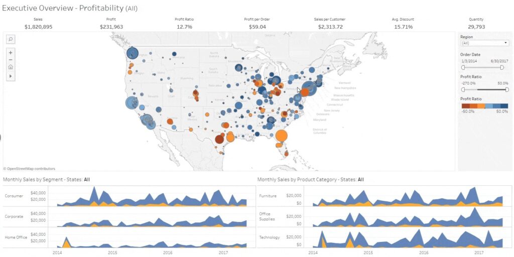
Here’s an example Tableau sales dashboard. You’ll notice that showing the insights is highly visual, and that analytics can be performed almost instantaneously as users change any setting on the dashboard. This viz uses Tableau’s clustering feature to uncover insights in the sales data across the United States.
Plans and Pricing
Tableau divides their product tiers by implementation and user needs. First, your business will need to decide whether you’d like to host Tableau on-premise, in the public cloud, or have Tableau host your server. Then decide how many of each of the following user type you need:
- Creator: This is a data analyst role who will load and standardize data. Every Tableau account is mandated to have at least one Creator
- Explorer: general business user role, can make and edit visualizations
- Viewer: can view and interact with visualizations Explorers and Creators have made
Tableau’s pricing differs between users of on-premise/public cloud and Tableau hosted, and bills annually. For on-prem, select the number of licenses you need:
- Creator: $70 USD/user/month
- Explorer: $42 USD/user/month
- Viewer: $15 USD/user/month
Pros
- Quick and easy representation of big data which helps in resolving the big data issues
- Can be used with no coding or development knowledge
- Easy to understand, drag and drop interface
- Can use pretty much any data source imaginable—Tableau integrates with over 250 applications
- Has an additional platform for cleansing and prepping data before it’s loaded and analyzed
- There’s a mobile app with comparable functionality
- Has a heavy community presence for learning in forums
Cons
- Some users criticize its collaboration capabilities: The notification functionality is simple, and only an admin can configure scheduled email subscription. Users can use custom Python to create trigger-based notifications, but that practice isn’t baked into Tableau.
- Can be a fairly expensive tool based on your business and needs
- To leverage the full capabilities of Tableau, users report a much steeper learning curve that that of other BI tools.
- Operates with a multitude of products that all handle a different aspect of the data analytics process. Some companies may enjoy the customized experience — it’s not for you if you’re looking for one tool that gives all users a transferable experience
The bottom line
Tableau is the top of the food chain for BI tools in terms of quality of analytics and visualization. However, for many users, the cumbersome process of piecing together multiple Tableau products and deploying on-prem may be too complex—and too expensive.
Looker
What it is
Looker is the data visualization tool owned by Google. Its main differentiator is its 100% browser-based experience, which eliminates the need for installation and maintenance at the same level as a tool like Tableau. Looker also emphasizes shareability in many of their opening statements, referring to the fact that the browser-based experience allows for link sharing, as opposed to sharing with files.
Like most other BI tools, Looker asserts that any novice can use it and that in-depth SQL knowledge can create more intricate reports, but isn’t strictly necessary. However, there does seem to be a significant investment in publishing lectures, documentation, and learning puzzles to appeal to Looker users across disciplines and learning styles.
With Looker, data analysts can use a language called LookML to create mini-applications that “add efficiency and power to data exploration.” Looker explains that the LookML syntax simplifies the development of powerful models and enhances the capabilities of SQL. According to them, “this language-based approach leads to faster query execution, and optimizes performance along the way.”
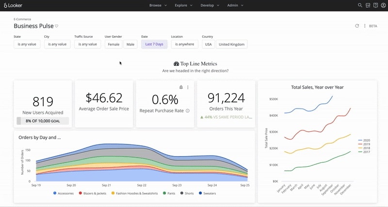
Below is an example of a Looker E-commerce dashboard that visualizes different data points from a sample company.
Plans and Pricing
Looker is unique from other BI tools in that it doesn’t publicly share its pricing, reasoning that it’s customizable for small, medium and large businesses. SoftwareConnect estimates the following prices:
- Generally $300-$500/user/month, up to 10 users
- $50/user/month after 10 users
Pros
- Emphasizes pre-built templates or blocks to speed up setup time and move more quickly to custom reports
- 100% browser-based experience eliminates the need for desktop client software installation and maintenance, and allows for link-based sharing of content – makes collaboration “frictionless”
- Consistent platform experience for all users; for instance, they can complete tasks without shifting from one desktop tool (i.e. Tableau Desktop), to another (i.e. Tableau Prep Builder), and then to the web to complete specific tasks.
- Users can leverage the ML code (that most say is fairly easy to learn) to help produce applications and optimize queries
- Still works for those with no SQL knowledge, as they have a rich database of videos and learning materials
Cons
- Some users report problems with load time, even calling the wait for a visualization “a run-in with the spinning wheel of death”
- Users report lessened functionality and viewability when using the mobile app
- If third-party estimates are correct, Looker can actually be more expensive than Tableau (which has gotten negative reviews for price) in some cases
- Out-of-the-box dashboard templates can be incredibly useful, but some report difficulty attempting to customize them
- Completely hosted means no options for fundamentally changing the tool besides waiting for a new release
The bottom line
If you don’t want to install and maintain an on-prem solution, Looker’s hosted platform has data visualization capabilities that rival or exceed other BI tools. You’ll be able to enjoy a report sharing experience that isn’t cumbersome, but watch out for load times and the inability to change the functions of the tool itself.
Domo
What it is
Domo Business Cloud, a low-code data app platform, refers to itself as: “the platform that allows everyone to drive action from data.” As with other top data visualization tools, users can combine data from disparate sources, and according to Domo, without needing duplication or pre-transformation to use.
Domo also includes collaboration tools that let teams communicate directly on visualizations with messages and annotations, in addition to scheduled updates and benchmarking alerts similar to those of other BI tools. There isn’t an on-prem deployment option, but Domo touts the cloud-based solution as a baked-in method to help your business scale indefinitely.
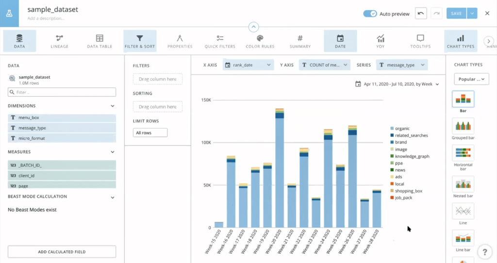
Below is an example of a Domo dashboard that uses Traject Data and shows the breakdown of all the different types of search features that appear in the chosen dataset.
Plans and Pricing
Domo’s editions are primarily divided by number of users, support level, and administrative options. The enterprise edition offers unlimited storage, data sets, personalized data permissions, and advanced admin controls.
Domo previously (until 2019) offered two plans: Professional ($175/user/month) and Enterprise ($250/user/month). They have since removed pricing from their website.
Pros
- Regarded as one of the fastest-operating BI platforms
- Provides templates based on business function
- Many users enjoy the UI more than that of other BI tools, citing its “vibrance.” If you frequently use reports to woo stakeholders, this might be meaningful
- Allows for team communication and collaboration directly on the platform
- Seamlessly blends data from hundreds of sources, the reason Domo has been able to gain traction on Tableau
- Offer 1-Click Apps: pre-built connectors that allow users to upload data without relying on IT
- As a cloud-based solution, implementation tends to be shorter than on-prem solutions like some Tableau
- Offers a full mobile app
Cons
- Can be difficult to configure connectors from different sources all at once
- No on-prem deployment option
- If you plan to create many similar reports, some users complain that you can’t copy a report and make slight changes to the copy, as it will update the original
The bottom line
If your business favors cloud-based over on-prem and will be using the tool for extensive communication and collaboration while building visualizations, Domo is a great option.
Power BI
What it is
You can expect that Power BI, the data visualization tool owned by Microsoft, will play nicely with other Microsoft products like Azure and Office. In fact, this is one of the first points that the Power BI website confirms.
These other Microsoft products, such as Power Apps, Power Automate, and Power Virtual Agents that create an “end to end” experience give users a feeling similar to picking and choosing certain Tableau products for a more customized experience, not the singular consistent experience of Looker and Domo.
Power BI connects to most types of on-premise databases, and they have a large and growing list of cloud-based connection options as well. Users report that it also works well for companies that don’t have a data warehouse solution, because Power BI acts as a facilitator that enables data set processing.
It has around 16 different chart types, which is a good, middle-of-the-road amount if you want to represent your data in a variety of formats and visualizations.
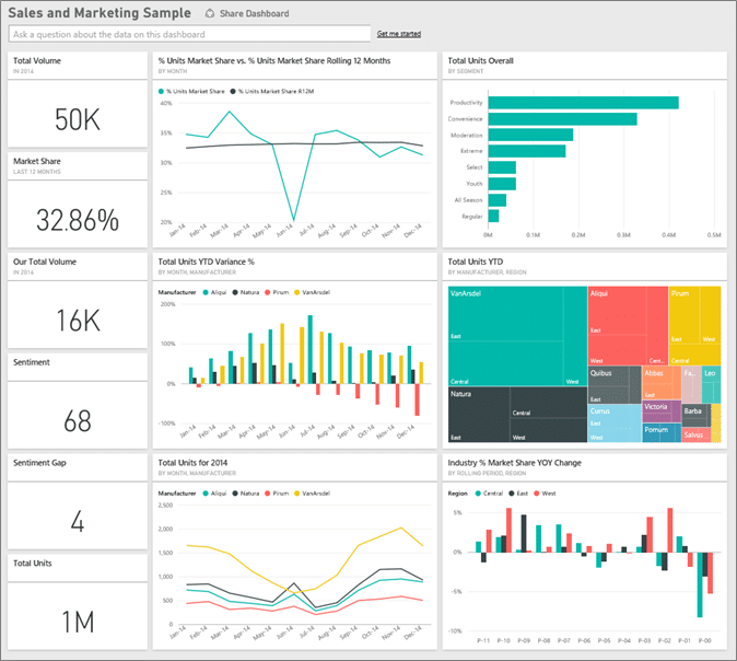
Below is an example of a Sales and Marketing Dashboard created with Power BI.
Plans and Pricing
Power BI has 2 plans. The Pro plan is the most inexpensive BI solution out of comparable tools in the market, but the Premium plan can get pricey.
Power BI Pro
- Self-service and modern BI in the cloud
- Collaboration, publishing, sharing, and ad-hoc analysis
- Fully managed by Microsoft
- $9.99/user/month
Power BI Premium
- Enterprise BI, big data analytics, cloud and on-premises reporting
- Advanced administration and deployment controls
- Dedicated cloud compute and storage resources
- Allows any user to consume Power BI content
- $20/user/month or $4,995/capacity/month for dedicated cloud compute and storage resource with annual subscription
Pros
- The most inexpensive tool of its caliber on the market
- Like the other tools, Power BI connects to hundreds of data sources and can read data from Microsoft Excel and text files like XML and JSON
- Boasts a mobile app with comparable functionality
- Anyone with moderately advanced Excel skills is likely to have an intuitive experience, as users report the functionality as being similar
- Microsoft releases updates to Power BI monthly and listens to the user community. If you submit suggestions for improvements, other users can rank the suggestions
- Plays well with Excel and is has easy export functionality
Cons
- Limits the size of datasets that you can pipe in – can try creating multiple queries to process the entire data set or shift to Power BI Premium
- On-premises reporting is only included in the Power BI Premium package, which can add additional costs
- Some users report the design is not intuitive and the UI/UX isn’t as pleasant as other tools
- Custom visuals don’t seem to be configurable – limitations to what can actually be changed if you want to optimize a visual
- No solution for data scrubbing, so data needs to be cleaned before using Power BI
The bottom line
If you don’t have a lot of budget and won’t be using datasets that exceed the size limit, Power BI will give you top-tier analytical capabilities—and may even listen to you on the updates you’d like to see.
Final Thoughts on Choosing a BI Tool for Traject Data
Because Traject Data works with all major BI tools on the market, decide on a tool that fits your business best with the above information in mind.
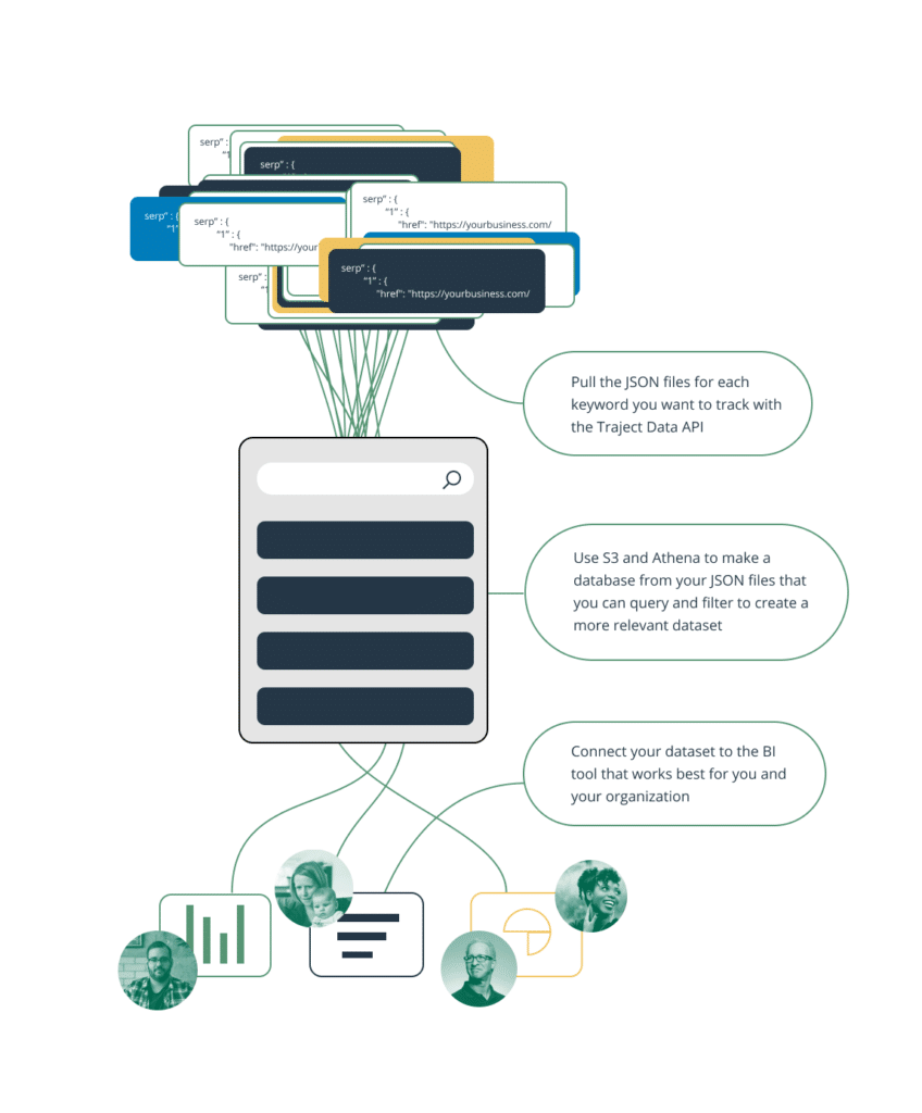
Once you’ve chosen a BI tool, you’re prepared to follow these 3 steps to begin visualizing the additional SEO data points our SERP API provides:
- Pull the JSON files for each keyword you want to track with the Traject Data SERP API.
- Use S3 and Athena (for example) to make a database from your JSON files that you can query and filter to create a more relevant dataset.
- Connect your dataset to the BI tool that works best for you and your organization.
Complete these steps, and you’ll have visualizations of endless keyword data to inform your SEO strategy and business decisions as a whole.